14 Dec, 2023
The Tops has been rebranded and over the coming months you’ll see their new look unfolding across communications and the site itself with new wayfinding signage being installed in early 2024.
Over the last year, The Tops and Corporate Communications teams have been working with James Agency to create a brand identity that is strong and modern, and one that aligns with the experience guests have on site.
Check out The Tops’ new website here.
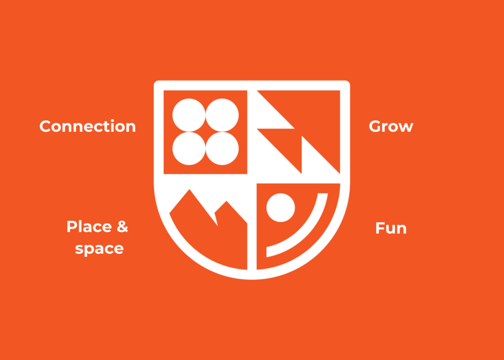
A lot of work has gone into creating meaning through the new logo supporting their beloved tagline “Life to the full”. Below is the breakdown of the four symbols that make up The Tops new brand identity:

Connection is essential for ‘life to the full’.
Dr Brene Brown describes connection as, “The energy that exists between people when they feel seen, heard, and valued.” This form of connection and interaction matters to us, we want to achieve all of those things, so that anyone who steps foot on our site feels like they are part of a community, like they belong.
Key words: Interaction, community, belonging
Growth is essential for ‘life to the full’.
We witness transformation every day at The Tops, as our guests discover, overcome and expand. We see true metamorphosis.
Key words: Expansion, transformation, discover, overcoming, metamorphosis
Place & space are essential for ‘life to the full’.
Community cannot exist without places & spaces — it’s where we find connection. We are so fortunate to be hemmed in by beautiful bushland, an environment perfect for you to connect with nature through immersive experiences, retreating from the everyday. In fact, research tells us that anxiety and stress dissipate when we commune in spaces full of nature.
Key words: Environment, nature, immersive experience, retreat
Fun is essential for ‘life to the full’.
Key words: Enjoyment, playfulness, active, positive, experiential, physical
